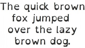
I stumbled upon this typeface nearly eight months ago, and thought that I had written about it, but after recommending it for the 3rd or 4th time, I realized that I had failed to actually create the post.
OpenDyslexic is a typeface that is specifically designed to be more usable for readers with, you guessed it, dyslexia. The characters are weighted (the lines are made thicker) on the lower portion of the letter, reducing the tendency by the dyslectic reader to mentally rotate the letter.
OpenDyslexic is not the first font designed this way, but it is the first open source, free typeface developed developed for dyslexia. It didn’t start out this way, and the story of how the murky legal landscape surrounding fonts and typefaces makes for an interesting read.
Here is a sample of the typeface:


